There is no limit as to how many charts you can create and subsequently select in the drop-down menu on your Dashboards. The same chart can of course be shown on several dashboards simultaneously.
Go to Dashboard to create a new chart.
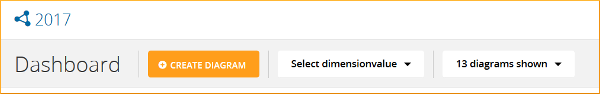
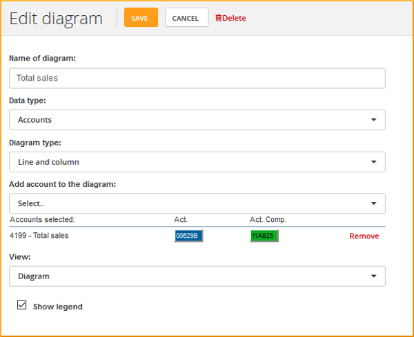
Click on the orange button [+ Create chart] and select data type, chart type og view. The chart is created when you click [Save]
You can edit any of the charts included in one of your Dashboards inside the dashboards themselves. Just open the dashboard, hover with your mouse over the chart you need to edit, and click on the text [Edit chart] that appears in the top right. Then you will then be able to edit the chart completely, e.g. alter the colours or change the data series or view. In the drop-down menu on the left you can change the chart type (e.g. from curve to columns).
How to move a chart around
On your Dashboard you can decide exactly where to place the chart. Just hover with your mouse over the arrow icon in the top left corner, hold down the left mouse button and drag the chart wherever you want it.
The layout of the page (if you can fit two, three or more charts) depends on how wide your screen is. report123 places them automatically in a line from left to right and then continues in the next row.
Hide or show legend
When editing a chart you can chose to hide or show the legend. A chart legend defines the content of a line or column.
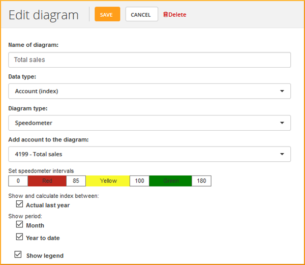
Speedometer charts
A speedometer chart indicates which parts of your business you need to monitor closely. Use it to keep a close eye on your KPIs and as an early warning sign.
The colour codes correspond to that of trafic lights so are easily recognizable to everyone.
To create a speedometer choose "Account (speedometer)" in Chart type. Here you can also adjust your colour, i.e. your tolerance levels for deviations.
How to change the chart colours
To change your chart colours click [Edit diagram] in the top right corner of the chart, and select a specific colour by clicking on the colour fields. In the colour scale on the right you can make the colour lighter or darker, and you can also enter a specific colour code to match your design profile.
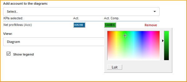
budget123 remembers your choice when you associate an account with a specific colour. The account will be shown with that same colour in all your charts.